There’s a conversation that happens constantly in the Shopify space about themes. Free versus paid.
Which one is better?
Which one is worth the investment?
Which one will make your website finally look the way you imagined it?
But the conversation is missing the point entirely.
The theme was never supposed to be the destination. It’s the canvas. And until founders understand that distinction, they’ll keep spending money on themes that look great in the demo but look generic the moment their content goes in.
The Free Theme Problem
Free themes are where most founders start. And I understand why. You’re building something, but you’re not ready to invest heavily in the website yet. The free theme gets you live and gets you selling.
But free Shopify themes have a specific look. After three years of building on this platform I can spot one from a mile away. They’re dull, they’re repetitive, and they’re genuinely difficult to customise without knowing what you’re doing technically. For a brand with bold packaging, distinct brand visuals, and a product that deserves to be taken seriously, a default free theme will work against you. It dilutes what your branding is trying to communicate before a customer lands on your homepage.
The Paid Theme Trap
So founders upgrade. They spend $200, $300, sometimes $500 on a paid Shopify theme. And paid themes are genuinely better. The features are more sophisticated, you get drag and drop elements like image sliders, marquee text, product hotspots, scrolling animations (which is now available on some free Shopify themes). They basically look more polished than a free Shopify theme
But here’s the trap.
After spending that much on a theme, founders don’t want to move away from it. The template looks good. The animations are nice. And after spending $300, you want to feel like you’re getting your money’s worth. So you stick to what the theme gave you. The thin, elegant font that came with the template stays, even if your brand packaging uses something bold and wide. The minimal layout stays, even if your products are loud and colourful and deserve more visual space.
I see this constantly. A brand with the most innovative product, the most distinctive photography, the most specific point of view, just pasting everything into a Broadcast or Wonder theme because it looks clean and luxurious. And yes, it does look clean. But clean and luxury isn’t the brief for every brand. For some founders, minimalism is exactly right. For others, it’s a costume that doesn’t fit.
The paid theme becomes a ceiling instead of a starting point.
The Real Problem
The issue with both free and paid themes is the same underlying thing: founders treat the theme as the answer when it’s actually just the beginning of the question.
A theme is a structure. It gives you sections, layouts, and functionality to work with. What it cannot do is translate your brand colours, typography, visual language, or the feeling someone should have when they encounter your products.
That translation is the work. And it requires someone who sees the theme the way a designer sees it: as a canvas, not a template.
What a “Custom” Website Actually Means
Custom doesn’t necessarily mean built entirely from scratch. It means starting with a theme and transforming it into something that couldn’t belong to any other brand.
When I built Joyof Food’s website I started with the Crave theme (free btw). I chose it because of its bold, boxy elements and confident use of colour. This structure suited what Joyof needed to communicate. But I didn’t paste her images and text into the default layout and call it done. I coded in her fonts, built her colour palette through every section, and translated the visuals of her packaging onto the screen. This resulted in a website that to this day gets described as my strongest project. People recognise it as Joyof Foods before they read the name, because the website feels like the brand, not a free Shopify template that happens to have Joyof’s content in it.
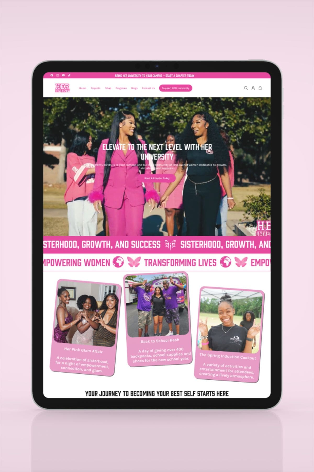
Even HER University started on the Sense theme, also a free canvas. Look at what the Sense theme looks like by default, then look at the bold pink website we built. Funders in grant meetings have complimented her site unprompted. Not because we spent hundreds on a premium theme. Because the design translated the organisation’s energy, mission, and its community into every page and section of the website.
The theme was the starting point in both cases. The brand was always the destination.
The Brands Getting This Right
There are consumer brands doing this exceptionally well. Graza, the olive oil brand, has a website where every colour, illustration style, navigation structure matches the personality of their distinctive squeeze bottle packaging. You’d recognise it anywhere.
Lemme, Kourtney Kardashian’s supplement brand, carries a specific softness and warmth across packaging and site that feels coherent.
Wild Dose, the bloating remedy brand, uses bold colour and directness that matches exactly what the product is trying to say.
None of these feel like a template someone dragged content into. They feel like brands that understood their brand visuals and made sure the website expressed it fully.
That consistency between the product, the packaging, and the website, is what retail buyers notice.
It’s what investors remember.
It’s what makes a new customer trust a brand they’ve never encountered before.
What This Means For Your Website
You spent significant money getting your branding developed. A designer spent time understanding your mission, your market, your personality, and translating all of that into visuals that’s specific to you. That work deserves to carry through to your website, and not get flattened into a template that was designed to suit anyone.
The experience someone has shopping your website should feel like the experience of picking up your product off a shelf.
If your current website looks like a free (or paid) template someone else could also be using, that’s not a theme problem, but a translation problem. And that’s exactly what a custom built website solves.
Branding doesn’t start with a template. Neither should your website.
JAL Studios builds custom Shopify websites that translate your brand identity into a site that’s specific to you, and not a theme anyone else could use. If your website doesn’t feel like your brand yet, start here.
0 COMMENTS