
Most websites are built with one person in mind. One type of customer, one type of language, one journey from landing page to purchase.
But some brands don’t have that luxury. They have a product that genuinely serves two distinct audiences, and the website has to speak to both without alienating either.
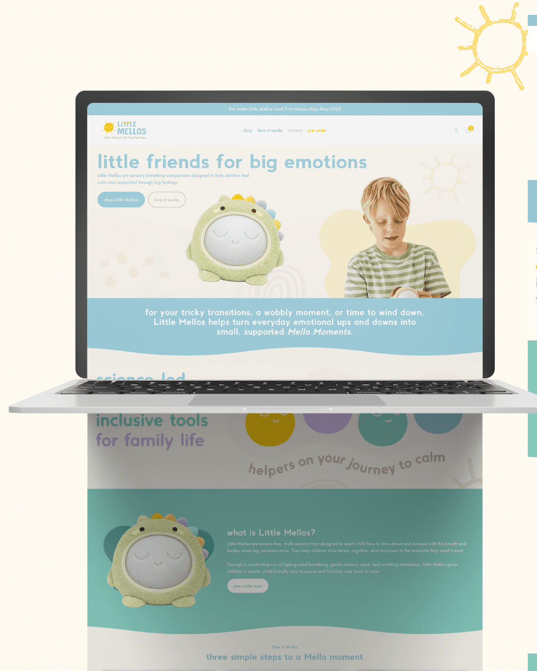
Little Mellos is a children’s wellness brand selling sensory toys designed to help children aged three and above manage overstimulation, anxiety, and overwhelm. The toy was built by a parent, therapist-informed in its development, tested with families, and CE certified. That combination of credentials meant the product had two very real audiences: parents buying for their children, and therapists, counsellors plus educators who could use it in therapeutic settings.
Here’s how we approached building a site that served both.
First — understand what the two audiences actually share
The instinct when designing for dual audiences is to create two completely separate experiences. A parent section. A professional section. Different language, different journeys, different calls to action.
But before you split anything, it’s worth asking: what do both audiences actually need from this site?
In Little Mellos’ case, both parents and professionals needed the same core things. They needed to understand what the toy actually did; not just that it was a sensory toy, but that it solved something specific. Anxiety. Overwhelm. Overstimulation. Emotions that children as young as three experience but rarely have tools to manage.
They needed to trust that the product was credible, hence the therapist-informed development, CE certification, and family testing being visible and prominent rather than buried in small print. And they needed to feel that this wasn’t just another toy in a crowded market.
When you identify what both audiences share, you stop trying to serve them separately and start designing an experience that works for both simultaneously.
Second — lead with the problem, not the product
When Little Mellos first came to me, the existing landing page was over-explaining the features and benefits of the toy. Every USP was listed. Every detail was covered. But it was doing so much explaining that the urgency got lost; and only a small number of visitors would read far enough to understand why they needed it, and even fewer felt compelled to act. The result was one preorder a month.
The shift was moving from leading with the product to leading with the problem it solves.
Sensory toys as a category feel like a subcategory of regular toys when you search for them online. What made Little Mellos different was that it wasn’t really a toy in the traditional sense. It was a tool with genuine therapeutic implications. A child feeling overwhelmed at school. A child who shuts down in social situations. A child whose anxiety manifests physically. These are real experiences that parents recognise immediately and that professionals work with daily.
When a parent or a therapist lands on the page and immediately sees their child or their client reflected in the problem being described, the product becomes an obvious solution rather than something that needs to be explained at length.
After the relaunch, Little Mellos received three preorders in the first week and five new email subscribers. Compared to one order a month on the previous site, that’s a meaningful shift driven by a change in how the product was framed, not what the product was.
Third — match the tone to the brand, not the audience’s industry
Here’s where a lot of dual audience websites go wrong. When one of your audiences are professionals such as therapists, educators, and healthcare practitioners, there’s a temptation to make the site feel corporate. Clinical. Serious. Because that’s what professional credibility looks like, right?
Not always.
Little Mellos is a children’s wellness brand. The product exists to bring calm and ease to children who are overwhelmed. A corporate website would have undermined that entirely. It would have communicated the professional credentials while completely losing the warmth, playfulness, and child-centred feeling that made the brand what it was.
We kept the design light, playful, and visually gentle, consistent with the branding she’d had developed; while making sure the credibility markers were present and prominent. Those details build professional trust without requiring the site to look like a brochure.
The lesson here is that tone should follow the brand’s identity and the emotional experience you want to create, not the professional status of one of your audiences. A therapist recommending a product to a family doesn’t want to show them something corporate. They want to show them something that already feels right for a child.
Fourth — give each audience a clear next step, even if the journey is shared
Both parents and professionals were arriving at the Little Mellos site, but they had different purchasing behaviours. A parent might buy one toy. A professional might want to buy in bulk for a therapy practice or a school setting.
The solution wasn’t to build two separate checkout flows. It was to make the primary call to action clear (preorder the toy); while making an alternative path available for bulk enquiries via email. One journey for the majority, one clear route for the exception.
This matters because if your website tries to accommodate every possible variation upfront, it creates hesitation. Most visitors should be guided toward one clear action.
The moral of the story
Designing for two audiences isn’t about splitting your website in half. It’s about finding the shared core: the problem both audiences recognise, the credibility both audiences need to see, the feeling both audiences should have when they land on your site, and building from there.
The differences between your audiences are usually smaller than they appear. What changes is the language you use to reach them, the credentials you make visible, and the specific next step you guide them toward. Get those right and one website can do the work of two.
JAL Studios builds custom Shopify websites for scaling product brands and impact-led organisations. If your brand is serving more than one audience and your website isn’t reflecting that clearly, start here.


0 COMMENTS